SQL data visualization
Visualize SQL data with Draxlr! Query, plot, and format charts easily to highlight trends, enhance readability, and customize insights.
Visualizing SQL data using Draxlr isn’t just about making your graph look better, it's about making your data easier to interpret, ensuring accuracy, and effectively conveying the insights you want to share.
Following three easier steps: Query, Plot, Format, will set you up with the exemplar envision.
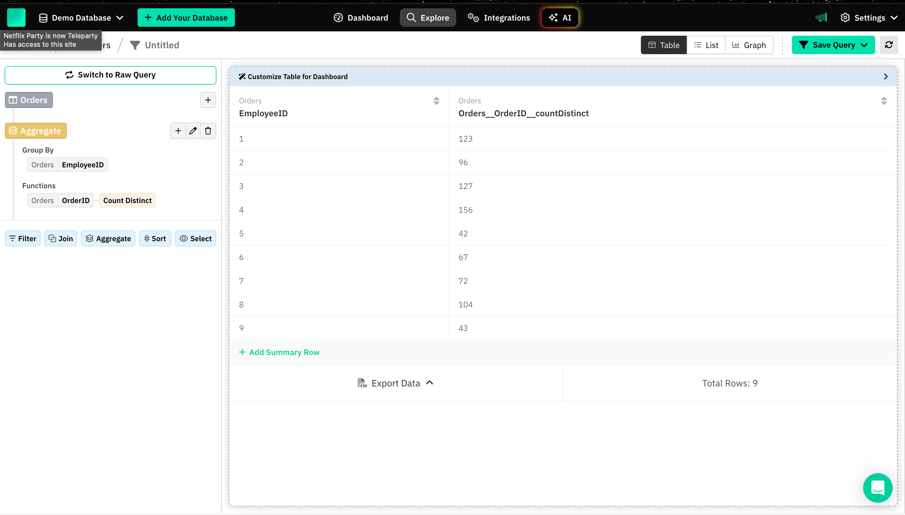
1. Constructing a SQL Query
Before creating a graph, you must generate the desired dataset by constructing SQL queries.
Draxlr offers 3 distinct ways to create SQL queries:
2. Plotting a graph
The next step is visualizing data using charts, which is a great way to make complex information more digestible.
Here are a few common types of charts that Draxlr offers:
- Bar chart
- Pie chart
- Line chart
- Area chart
- Scatter chart
- Scatter Bubble chart
- Radar chart
- Polar chart
- Funnel chart
- Map chart
- Box and Whiskers chart
- TreeMap chart
- Sankey chart
- Doughnut chart
3. Formatting different aspects of a Graph
Formatting a graph involves tailoring different elements such as titles, labels, axes, colors, grids, and styles to make the graph more readable and visually appealing.
Here are different types and examples varying to different charts for formatting a graph:
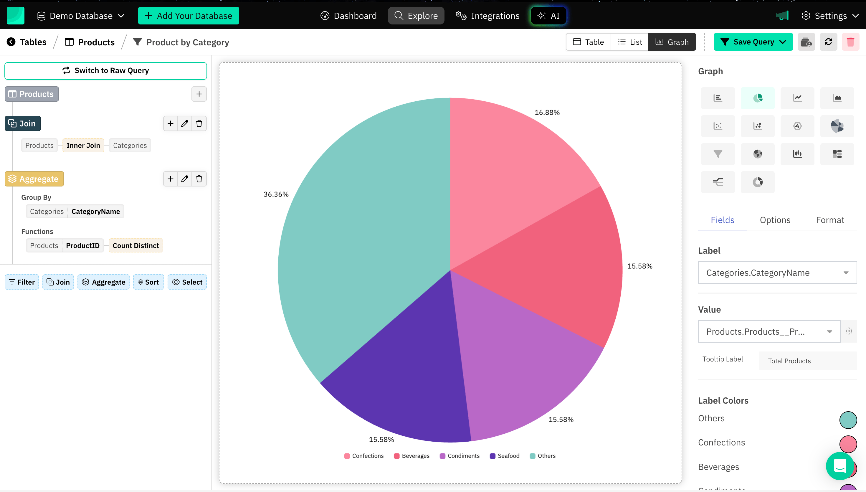
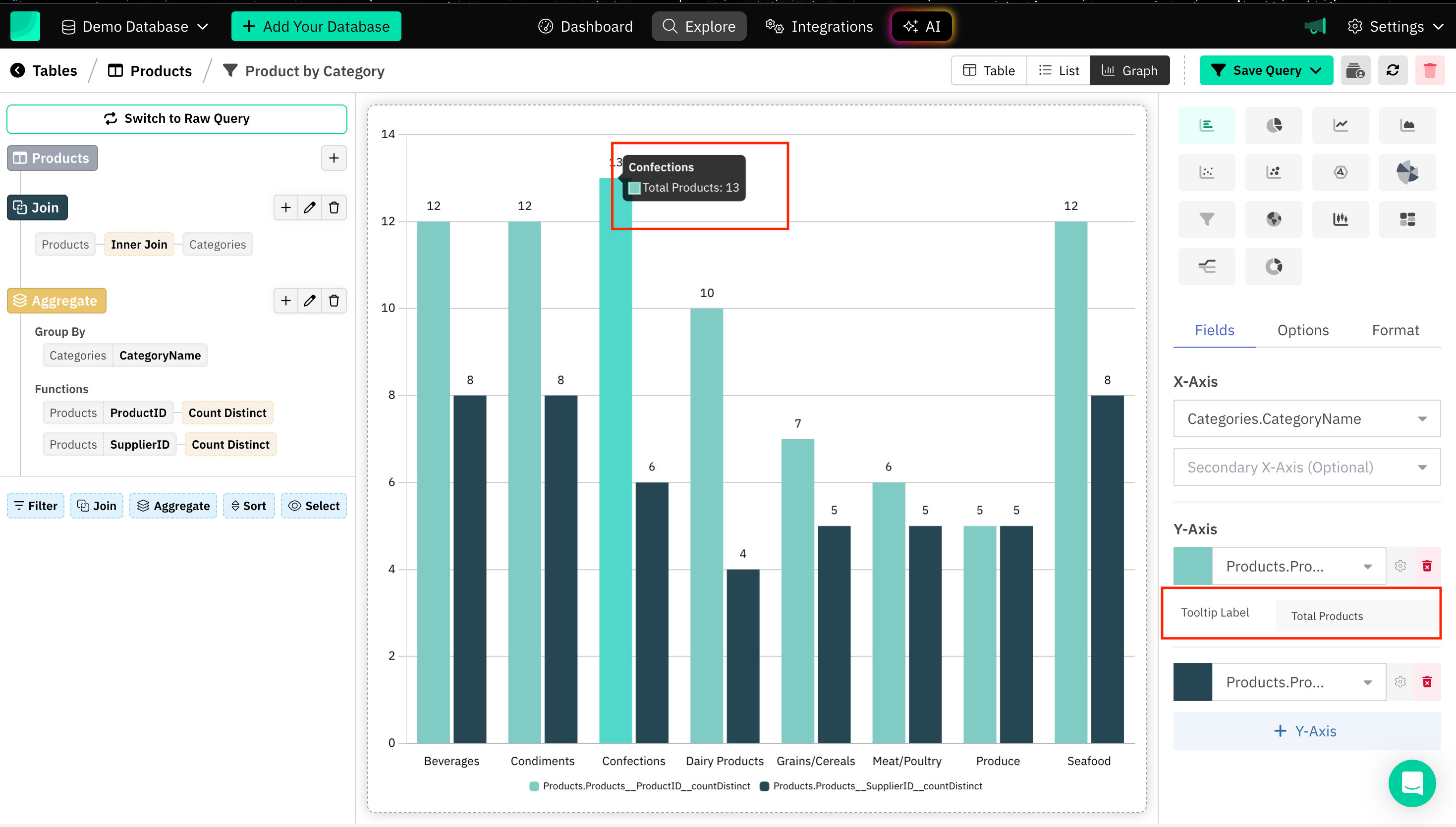
Tooltip Label
Tooltip Label is a text box or pop-up that appears when you hover over or interact with a specific data point on the graph. It can be added specifically to different axes in case of a multiple axes graph.
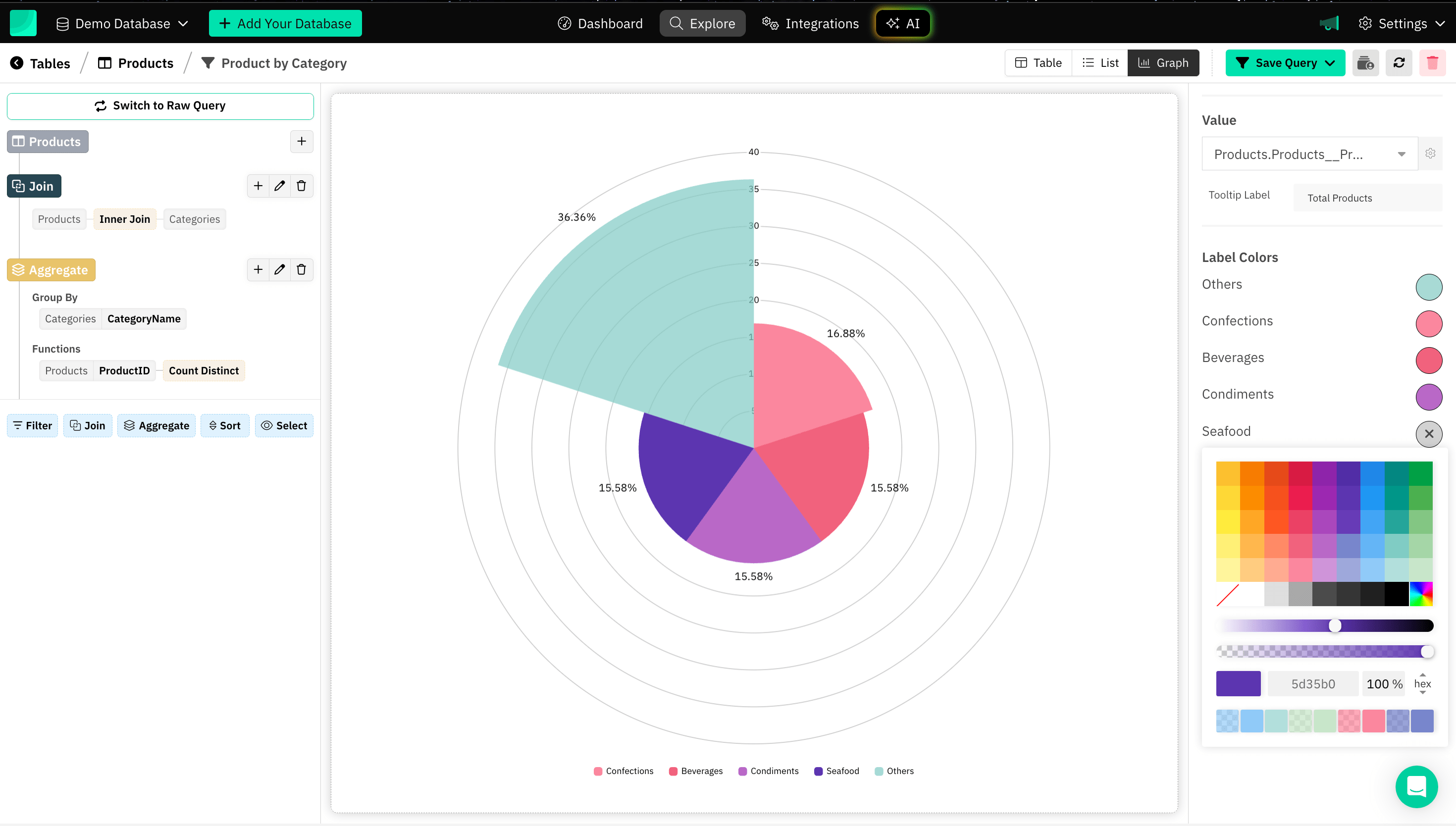
Label Color
Setting label colors in a graph can be useful for a variety of reasons, particularly in enhancing the graph's readability, aesthetics, and accessibility.
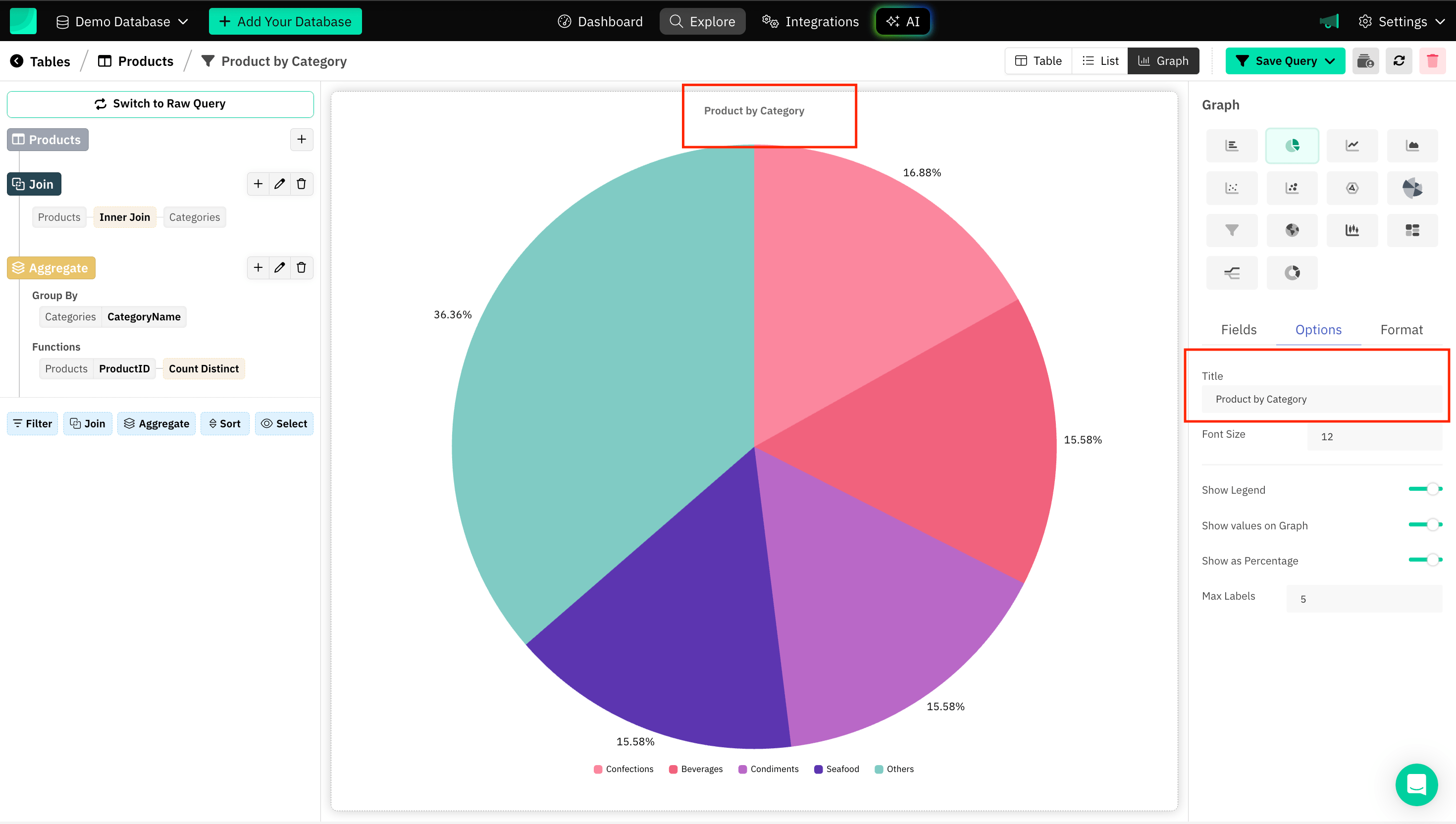
Title of the Graph
Providing a title to a graph enhances the understanding and context of the data being presented.
Axes Title
Axis titles make graphs more accessible, especially for people who are unfamiliar with the data or subject matter.

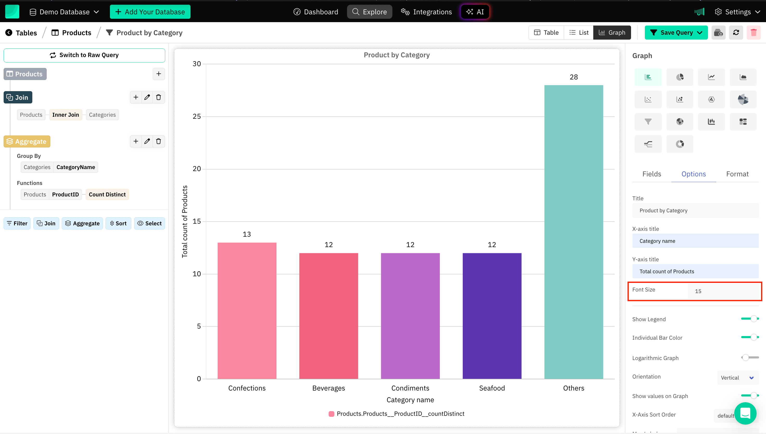
Font Size
Choosing the right font size ensures that your graph conveys information clearly and is accessible to a wide audience.
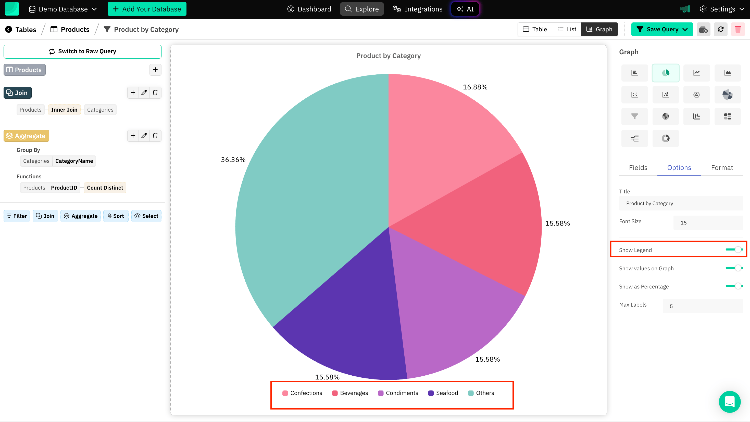
Graph legend
Legends act as a guide to identify what different colors, lines, or markers represent, especially in graphs with multiple data sets.
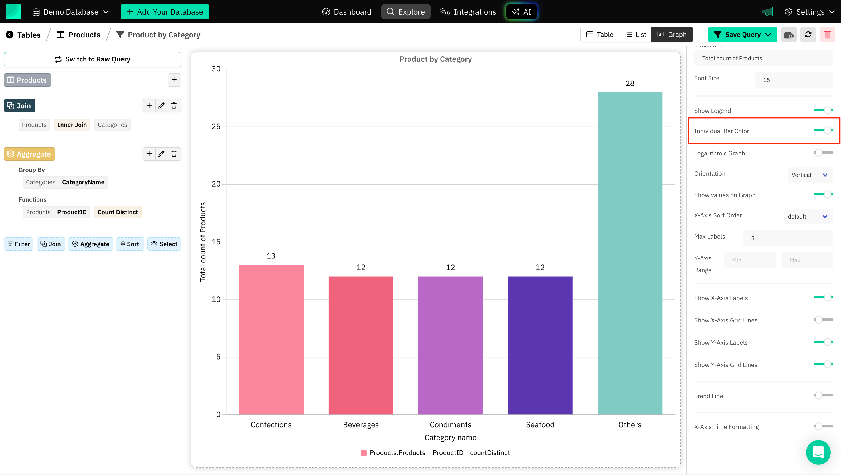
Individual Bar Colors
Individual bar colors can be set for Bar Charts. By assigning different colors to each bar, you can highlight distinctions between categories, draw attention to specific data points, and improve the overall aesthetic of the graph.
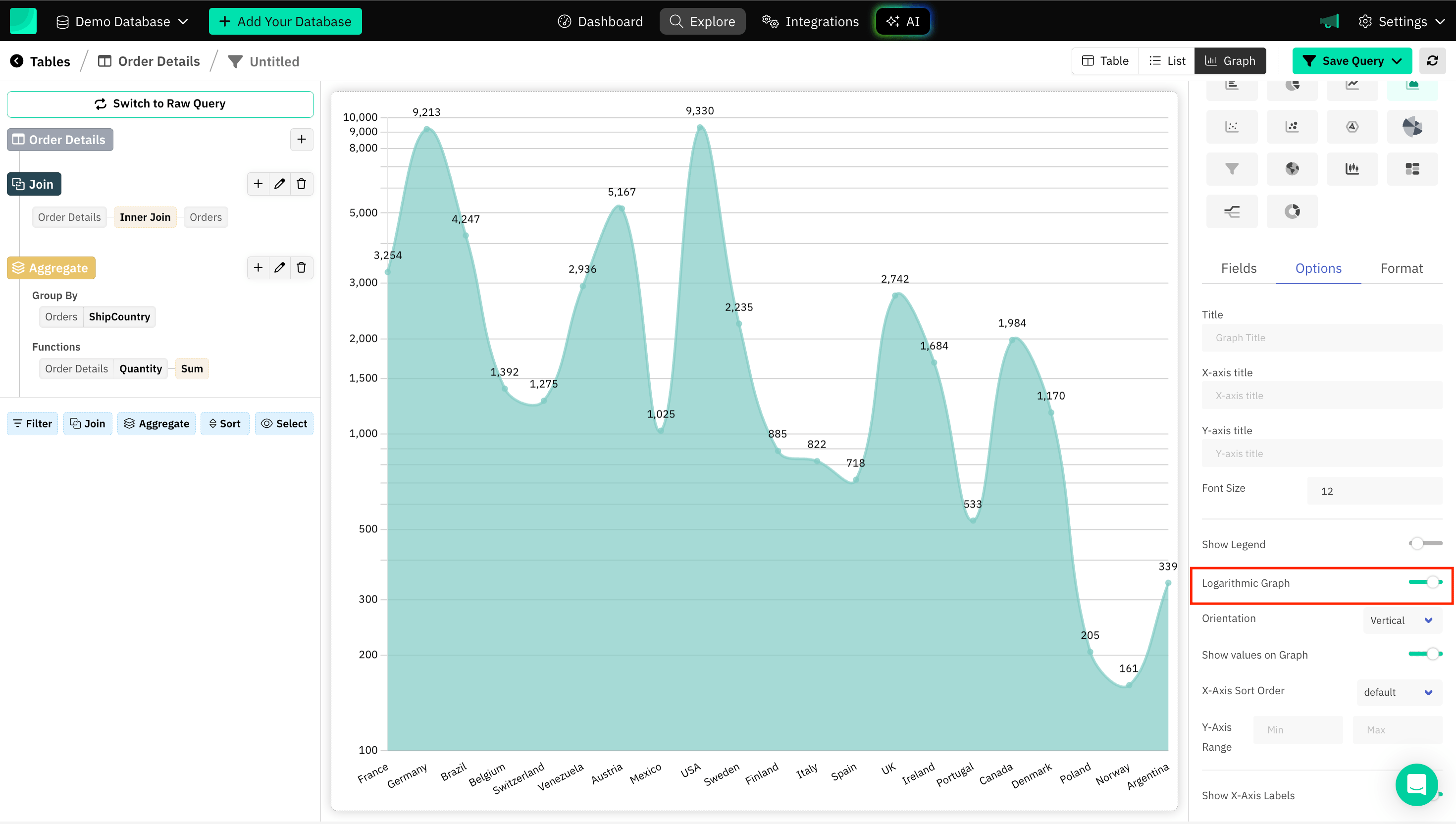
Logarithmic Graph
Plotting a logarithmic graph (or using a log scale) can be extremely useful for visualizing data that spans a wide range of values, especially when the data grows exponentially or has a few large outliers.
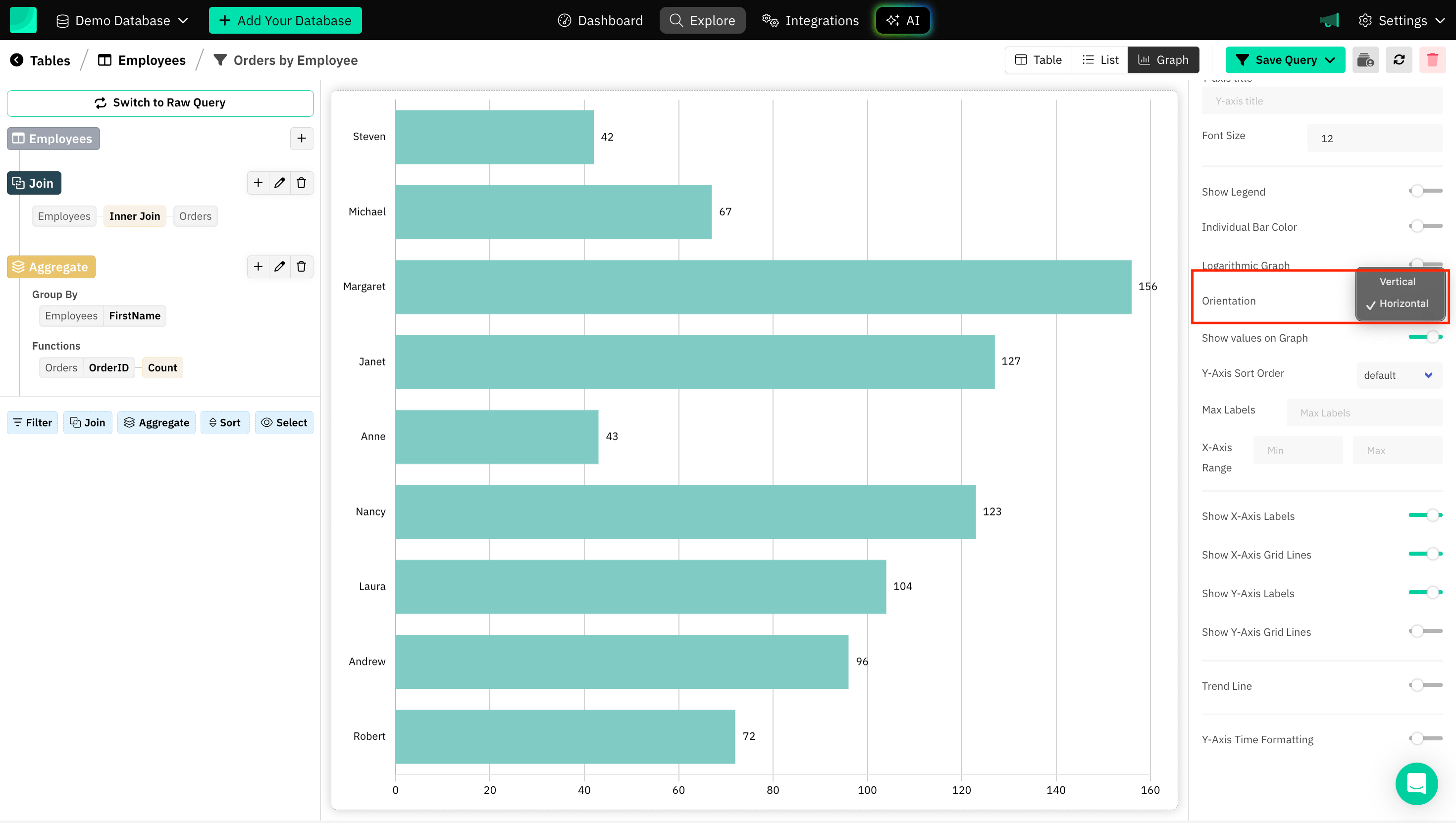
Orientation of a Graph
It typically refers to whether the graph is vertical (portrait) or horizontal (landscape). Choosing the correct orientation depends on the type of data you're working with, the number of categories, and the specific context in which the graph will be presented.
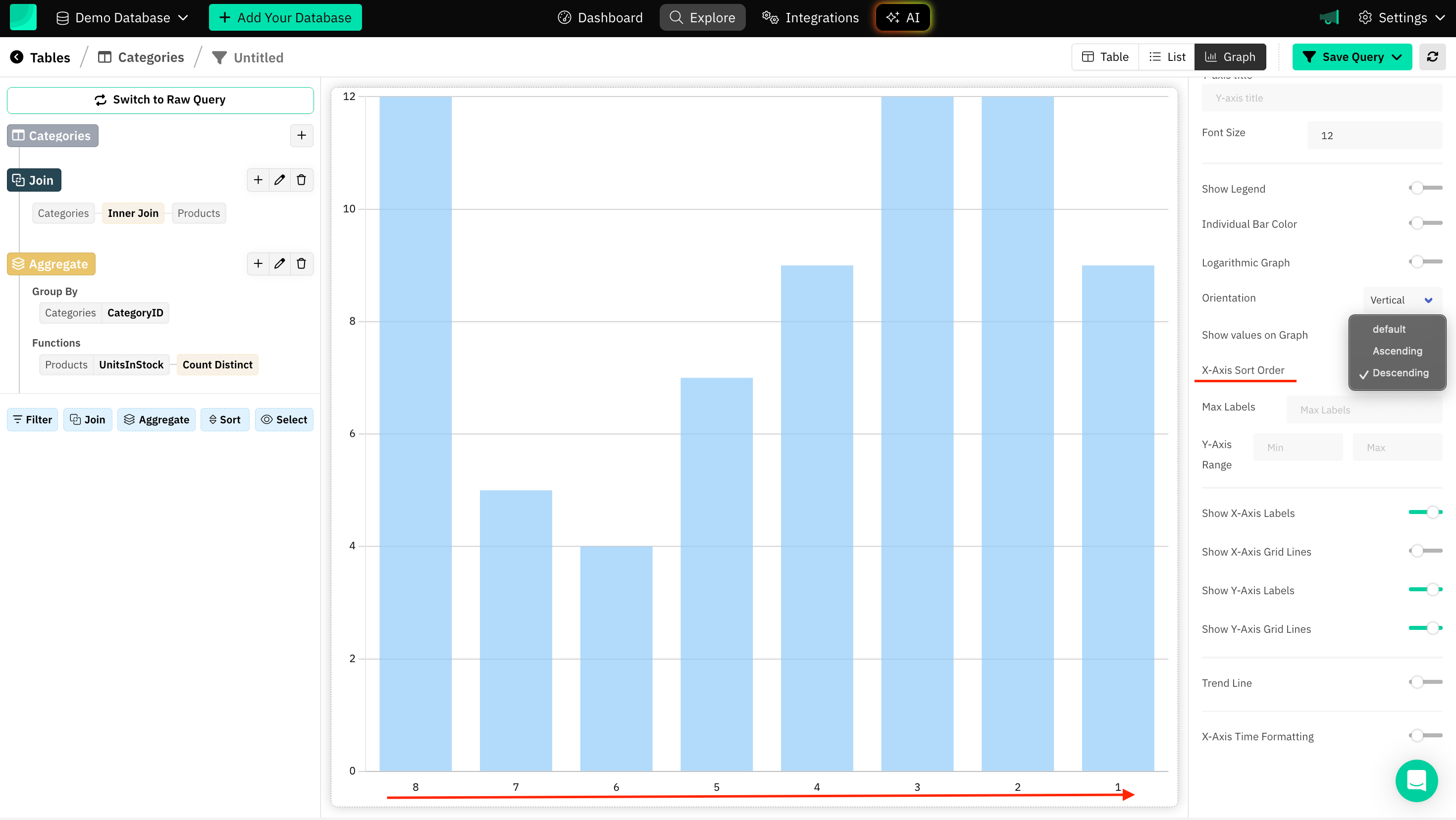
Sort Order of Axis
Sorting can help reduce clutter in the graph and make the data more readable. Sorting them alphabetically, numerically, or by frequency (from highest to lowest) helps organize the chart, making it easier to follow.
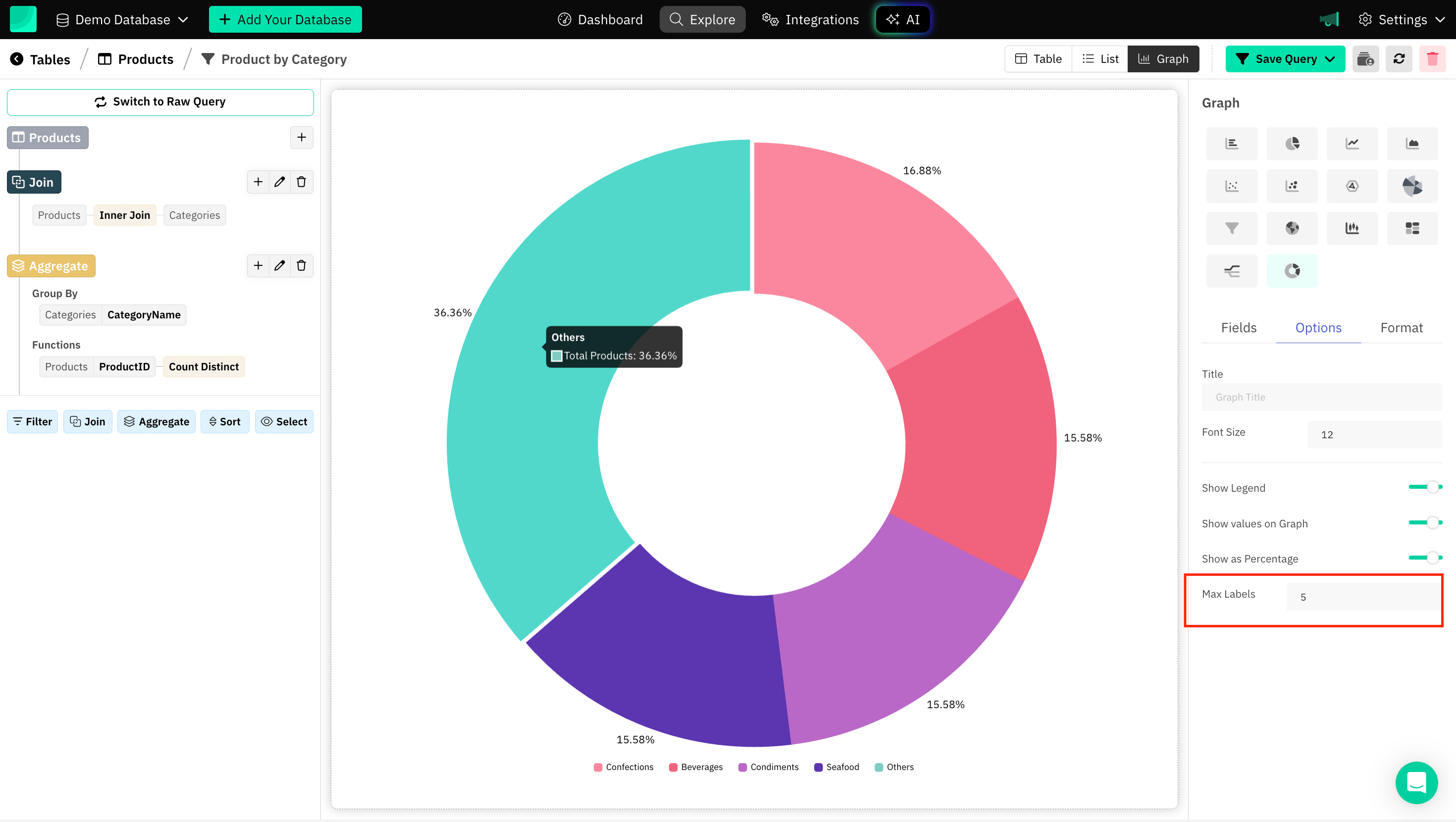
Max Labels
Grouping smaller parts into a limited number of labels is a helpful technique for maintaining clarity in a chart. It ensures that the chart is focused on the significant data points while still accounting for minor contributors. Grouping them into "Other" prevents the chart from becoming unreadable.
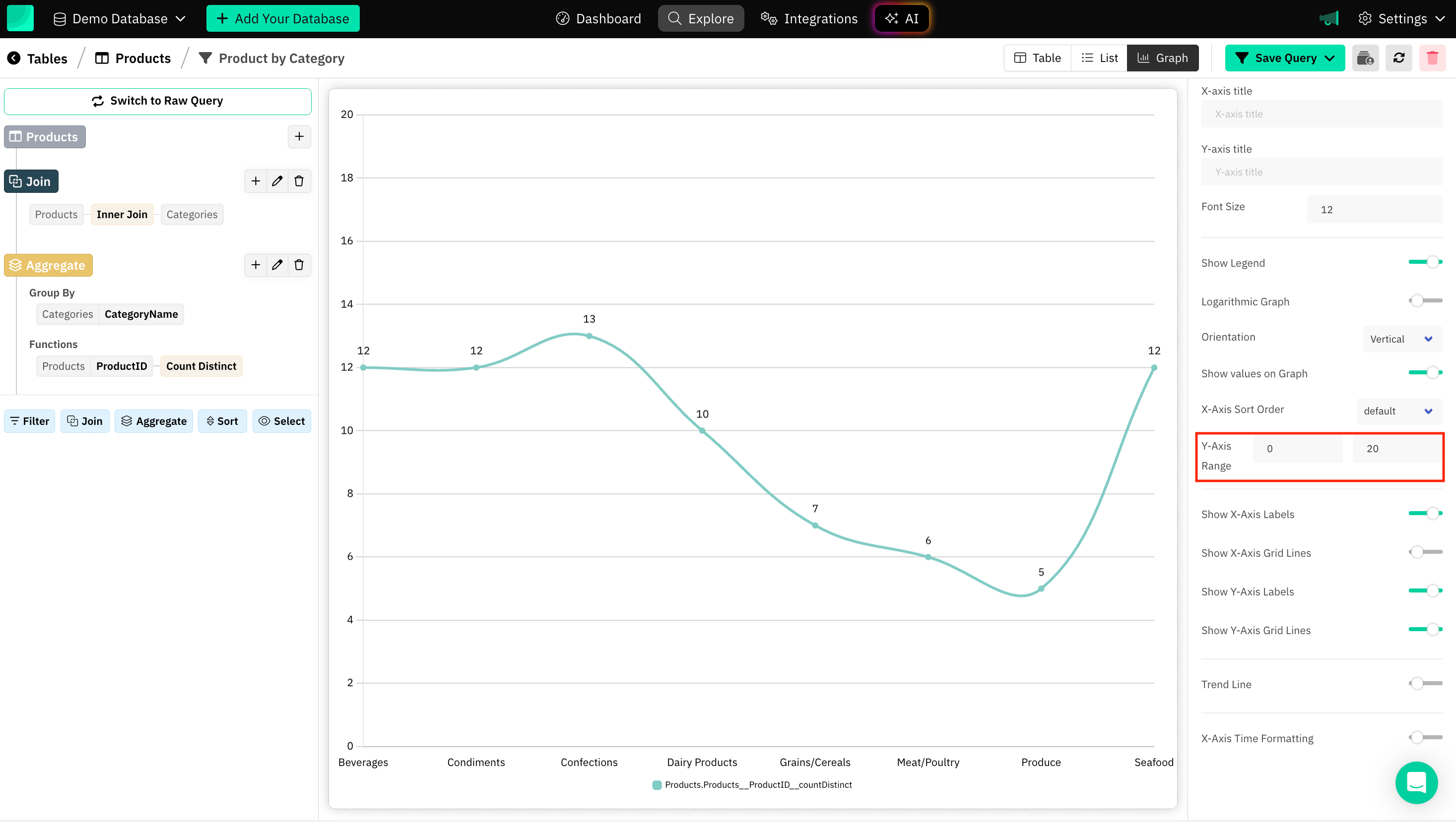
Axis Range
Setting a range is helpful, especially when you want to focus on a specific portion of the data or ensure that the axis limits are fixed for comparison purposes.
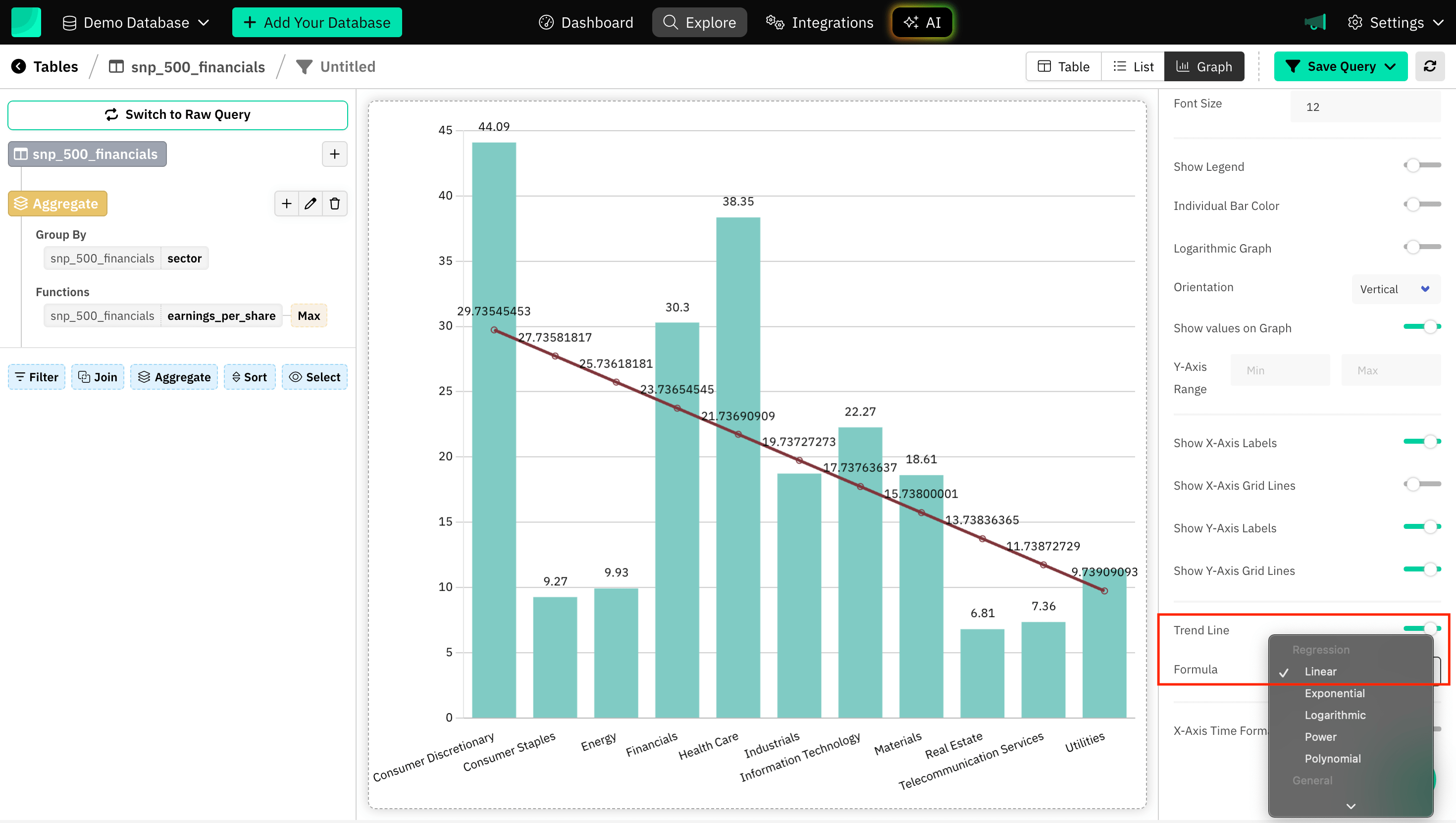
Trend Line
Trend lines are especially useful when you want to emphasize the general direction or behavior of the data points rather than focusing on each individual data point.
Choosing the right type of trend line and applying it thoughtfully, you can significantly improve the communication of your data:
- Linear - Steady, consistent growth or decline.
- Exponential - Rapid growth or decay.
- Polynomial - Complex fluctuations or multi-peak data.
- Logarithmic - Fast initial change that levels off.
- Power - Data showing proportional relationships.
- Minimum, Maximum, Average - Smoothed minimum, maximum and average over a window.
- Custom Value - Tailored to specific parameters or insights.
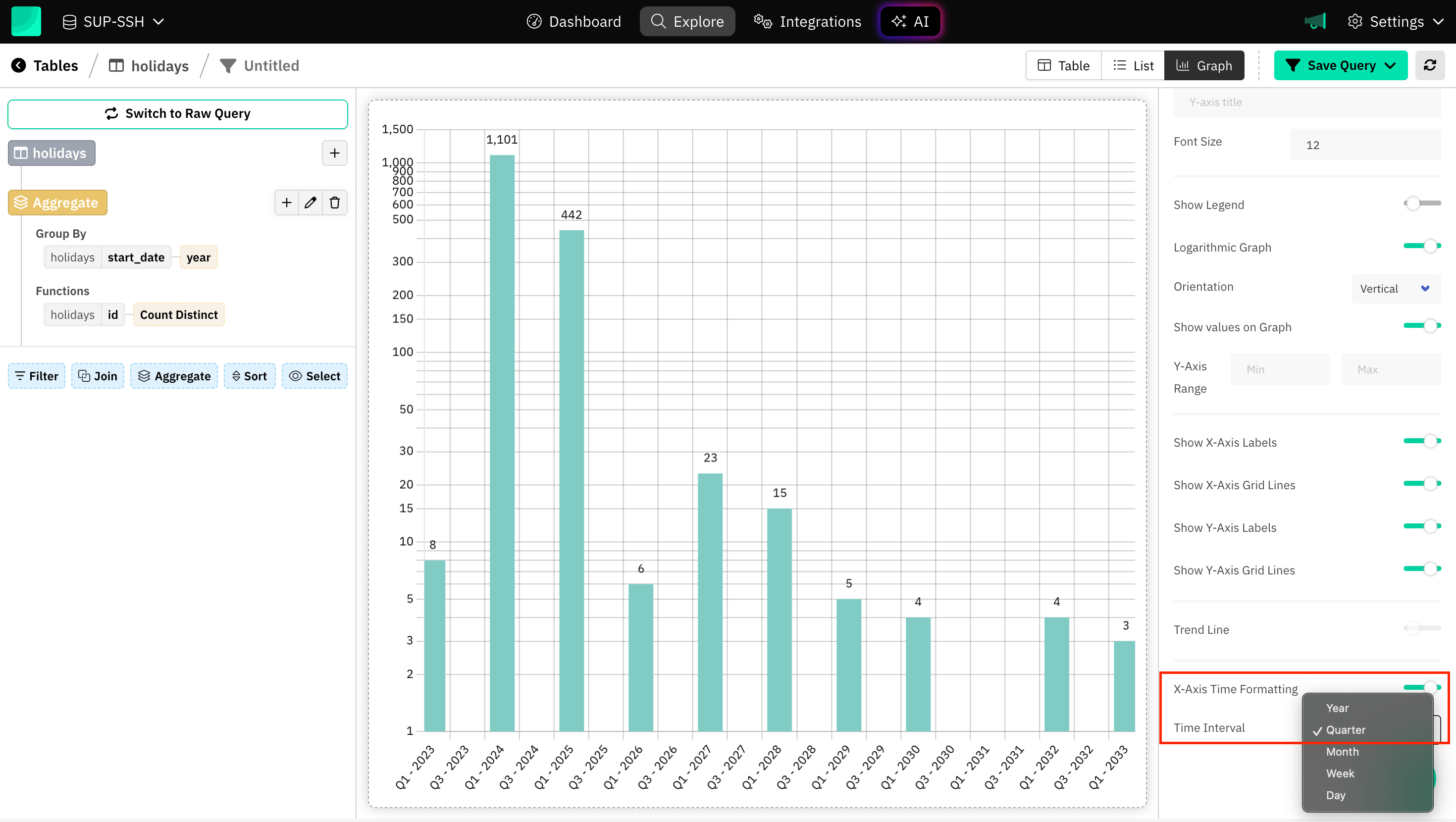
Axis Time Formatting
Time-based data often spans days, weeks, months, quarters or years. Proper formatting ensures that the time axis is easy to read. Draxlr automatically determine the spacing between time intervals once the interval type is selected to match your data’s characteristics.
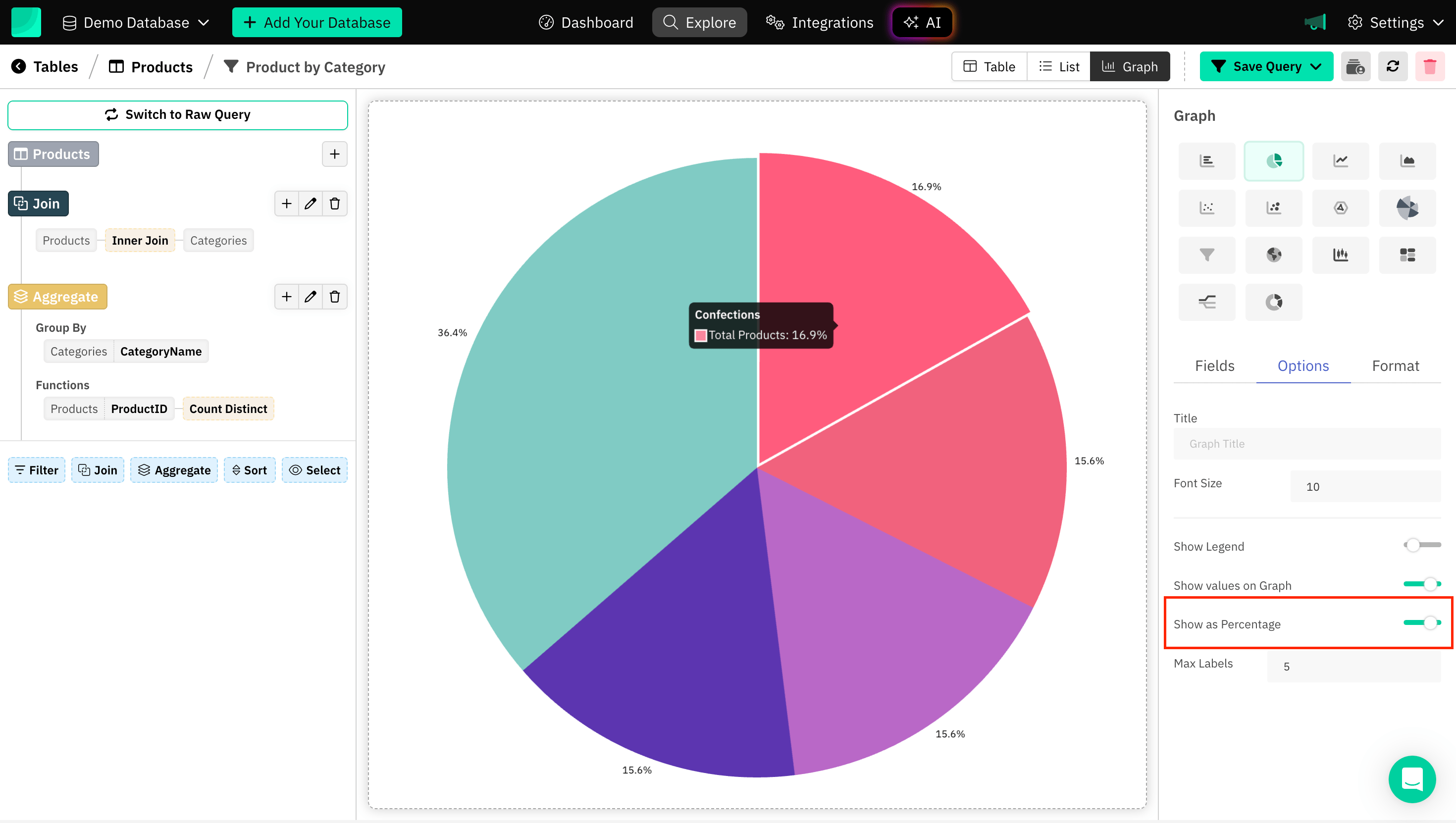
Showing as Percentage
Displaying values as percentages in charts like pie charts and doughnut charts helps to visually communicate how each category contributes to the whole dataset in terms of percentage.
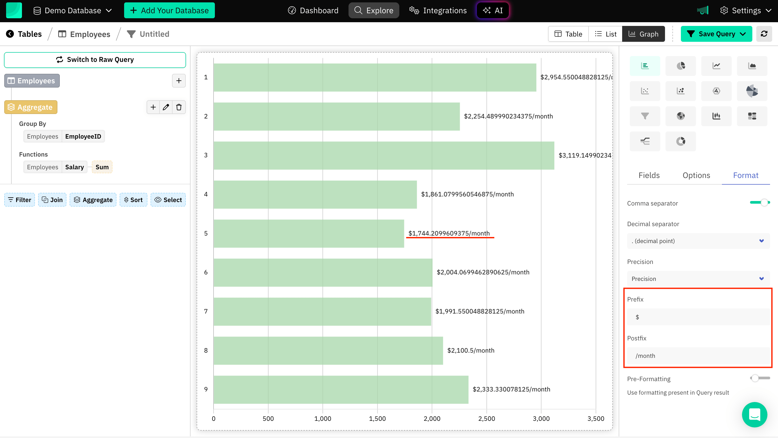
Prefix and Postfix
Prefix and Postfix are generally terms related to the positioning or formatting of data, and labels with characters to convey a relationship within the SQL charts.
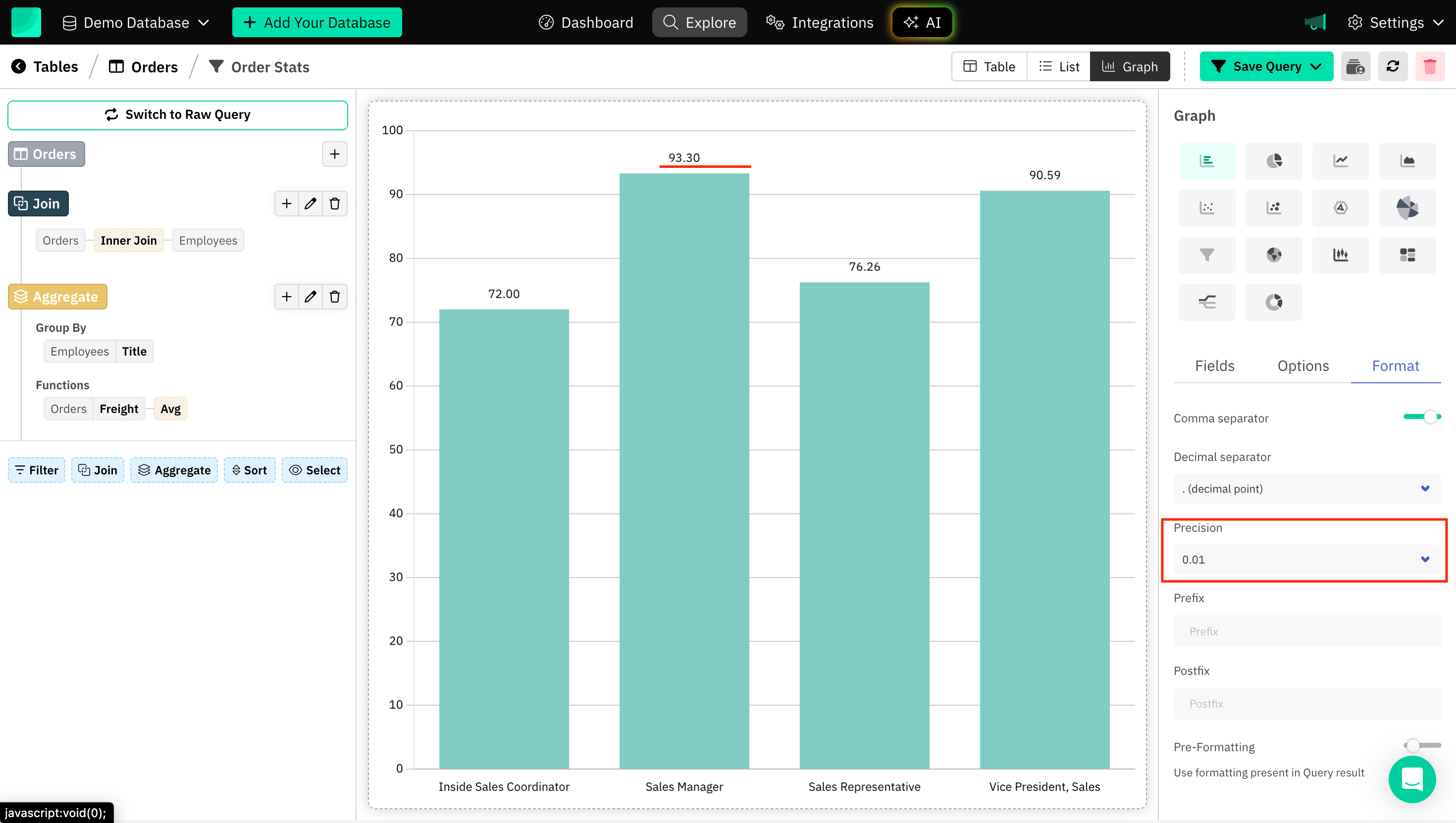
Precision
Refers to controlling the number of decimal places displayed for data points. You may want to display values with higher or lower precision, depending on the context and the level of detail you need to show.
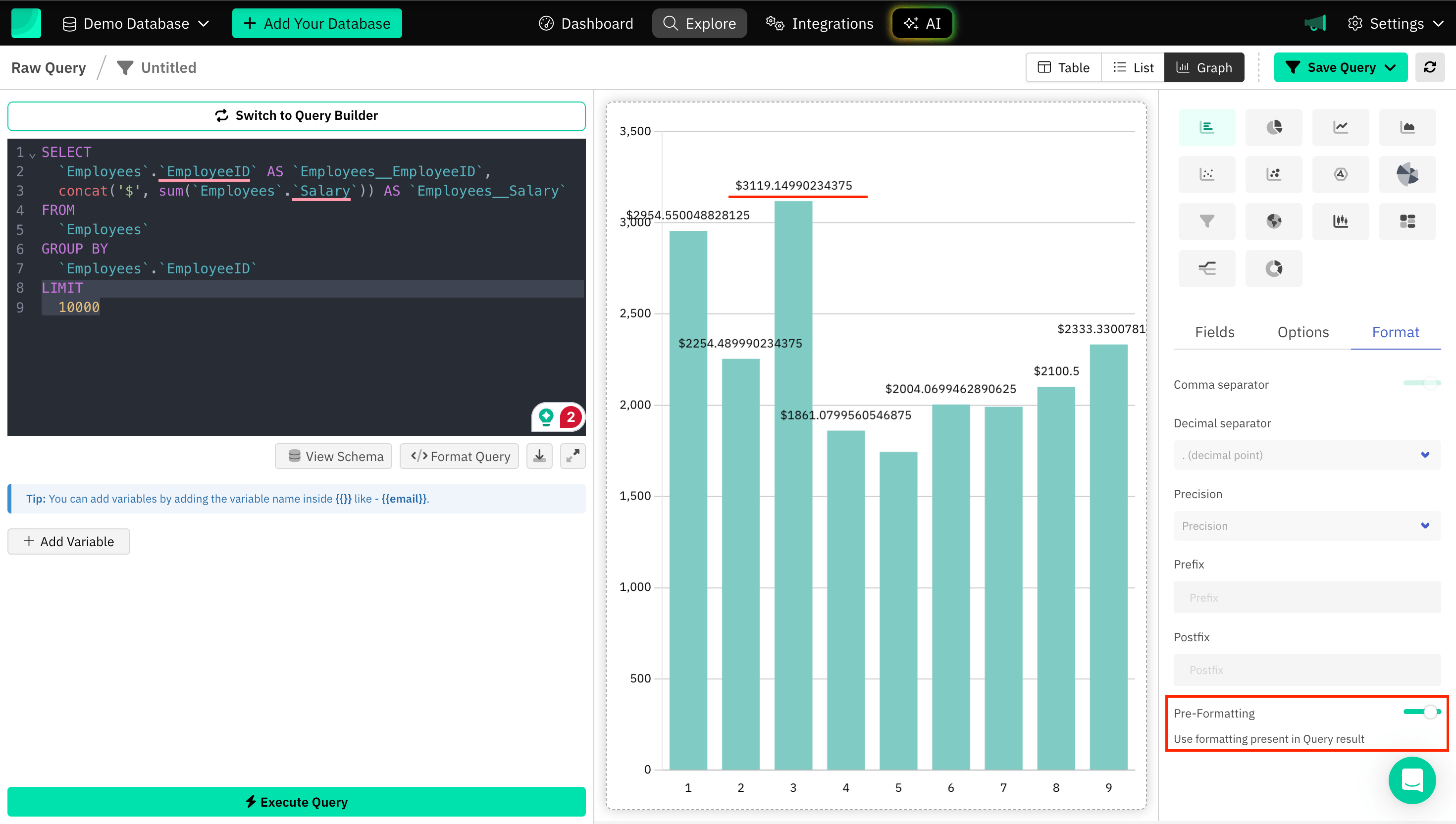
Pre-formatting
Adding pre-formatting to a graph typically involves configuring how data is displayed before it is visualized, means use formatting present in Query result and ensure that the presentation aligns with specific formatting needs.
Frequently Asked Questions (FAQs)
1. What is graph formatting in a BI tool?
Graph formatting refers to the process of customizing the appearance of charts or graphs to make them clearer, more visually appealing, and easier to interpret. This includes adjusting colors, axis labels, titles, legends, fonts, gridlines, and other graphical elements.
2. Can I visualize SQL data in real-time?
Yes, Draxlr allow for real-time data visualization by setting up live connections to your SQL database. Meaning the charts will automatically update when the underlying data changes.
3. What kind of tool is SQL visualization?
SQL visualization is a tool that transforms raw SQL query results into interactive charts and graphs for better data analysis. Draxlr is a powerful SQL visualization tool that allows users to run queries, create insightful visualizations, and format graphs effortlessly. With Draxlr, you can convert complex SQL data into easy-to-understand visual insights, helping you make data-driven decisions quickly. 🚀
Conclusion
Using Draxlr, you can ensure your data has Improved Readability, Visually Appealing, Highlighting Outliers, Trends, and Tailoring to Audience Needs. Draxlr provides a wide range of chart types, each chart type comes with extensive customization options, allowing users to personalize their visualizations to match their data needs and presentation preferences.