Supabase Data Visualization with Draxlr
Draxlr simplifies Supabase data visualization with query builder, AI-generated SQL, and custom dashboards. Create insights, embed reports, and set alerts easily.

Data visualization is a crucial component of modern data analysis. It helps users:
- 📈 Interpret large datasets quickly
- 🔍 Identify patterns and trends
- 🧠 Make informed decisions
- 🎨 Transform raw data into visually engaging charts and graphs
- 📑 Improve reporting and enhance communication
- 🚀 Drive strategic growth through data insights
- ⚠️ Detect anomalies in data
- ✅ Ensure data-driven decision-making across teams
Supabase is a powerful backend-as-a-service platform that enables developers to manage databases effortlessly. However, making sense of the data requires strong visualization tools. This is where Draxlr comes in, providing seamless integration with Supabase for intuitive data visualization.
3 Ways to Build SQL Queries for Visualization in Draxlr
Before creating visualizations, you need to generate the desired dataset by constructing SQL queries.
Draxlr offers 3 distinct ways to create SQL queries, catering to users with different levels of SQL expertise:
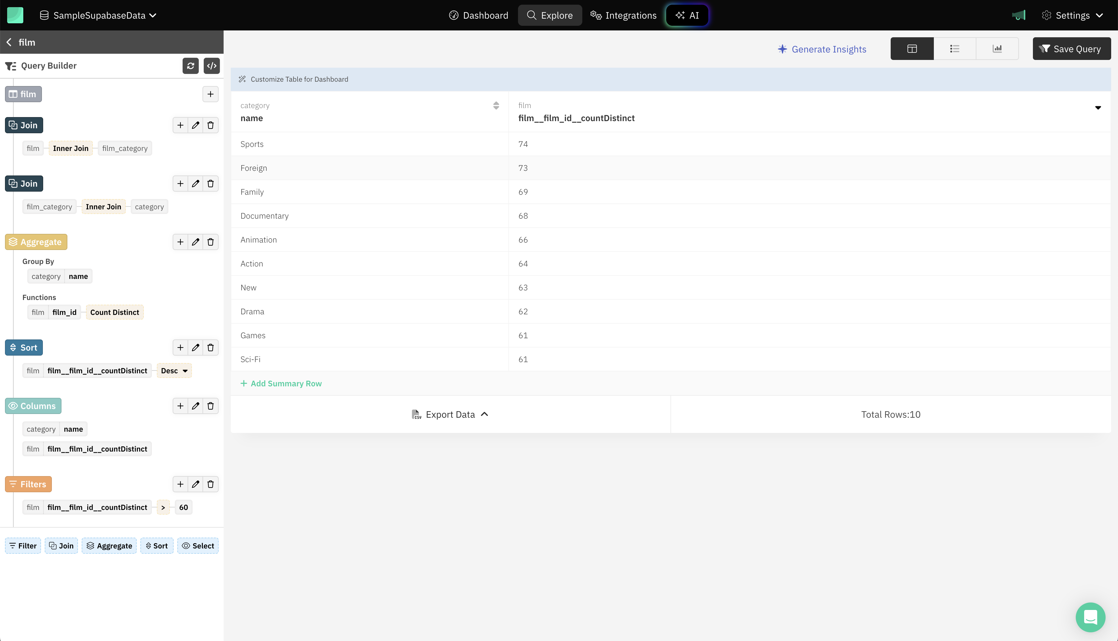
1. Query Builder
For those who prefer a no-code approach, Draxlr’s query builder allows users to create queries using a visual interface. This method is perfect for users who may not be familiar with SQL but still want to generate meaningful insights.
Draxlr Query Builder offers 5 options in Query Builder:
- 🔎 Filter - Filter Supabase table data by value of a specific field.
- 🔗 Join - To combine multiple Supabase tables to analyze data from them.
- 🔄 Sort - Order Supabase table data by a field value.
- 📊 Aggregate
- Group by - To group data by a field, or formatted field data.
- Function - Apply functions like min, max, sum, average, count, and distinct count.
- 🎯 Select - Specify which fields to show in the result.
You can apply the above options in steps, each step is applied to the result of the previous step. You can create complex queries using it, and even convert the query to raw SQL query to add further customizations.
2. Raw SQL
For users who are comfortable writing SQL, Draxlr provides an option to enter raw SQL queries.
You can incorporate variables into your raw SQL query, enabling dynamic customization and reusability of the query to generate custom results efficiently.

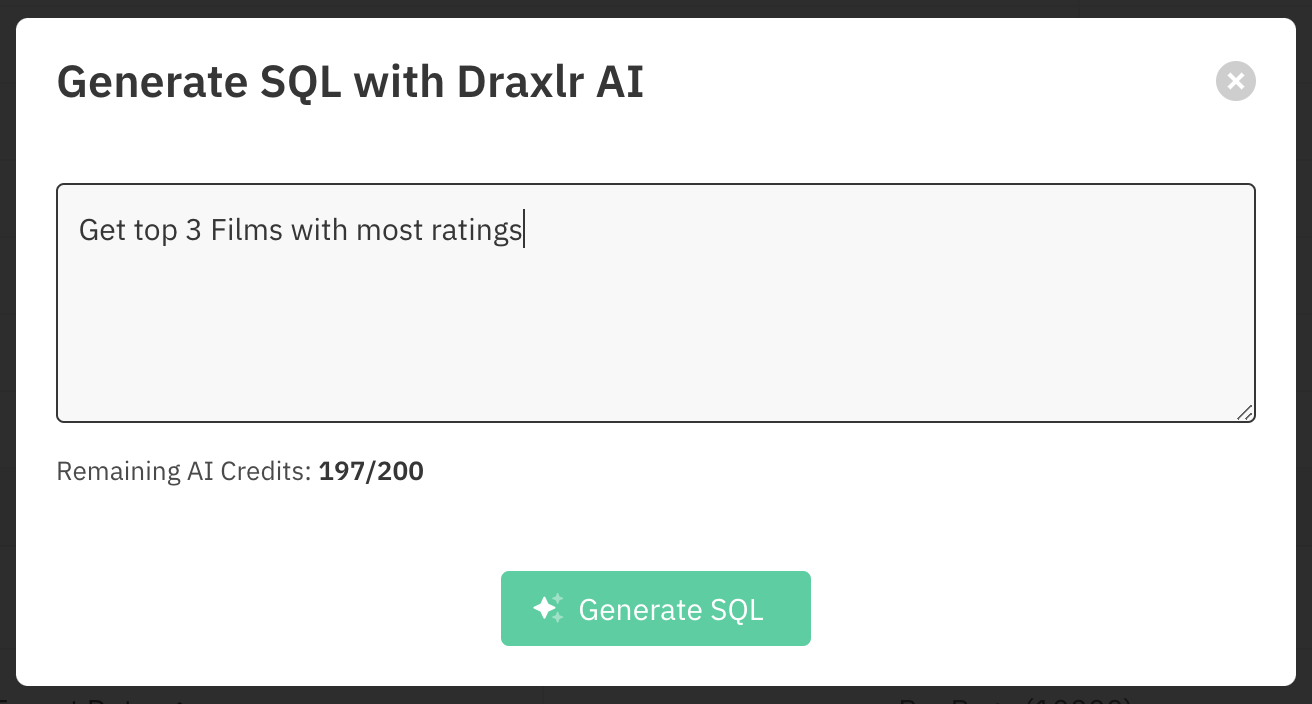
3. AI-Powered Query Generation
Draxlr leverages AI to help users generate SQL queries effortlessly. Users can describe what they need in plain language, and the AI translates it into SQL, eliminating the need to write repetitive queries from scratch.
This significantly saves time for tech users by automating the generation of base SQL queries, allowing them to focus on refining complex logic rather than spending time on basic query structuring.
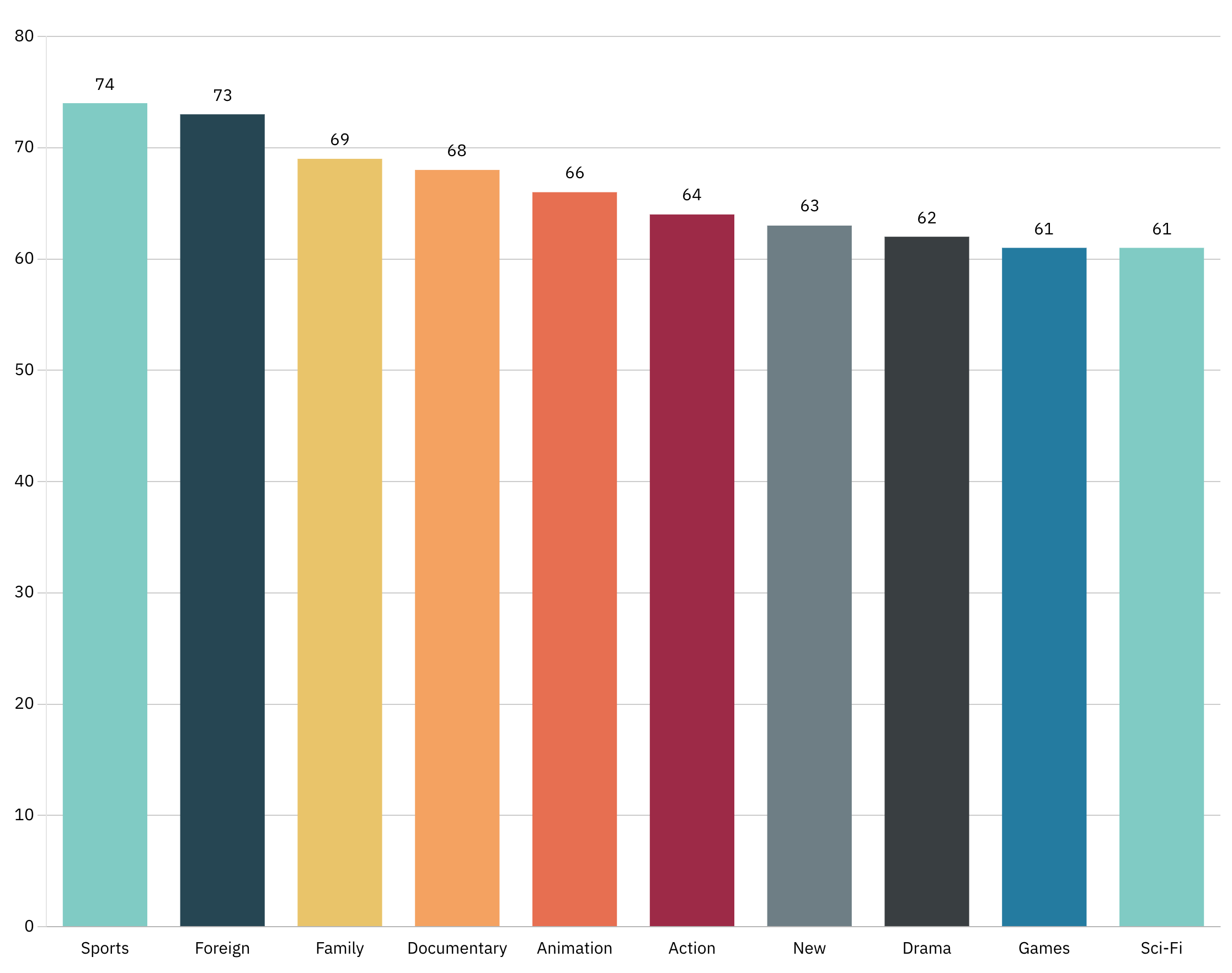
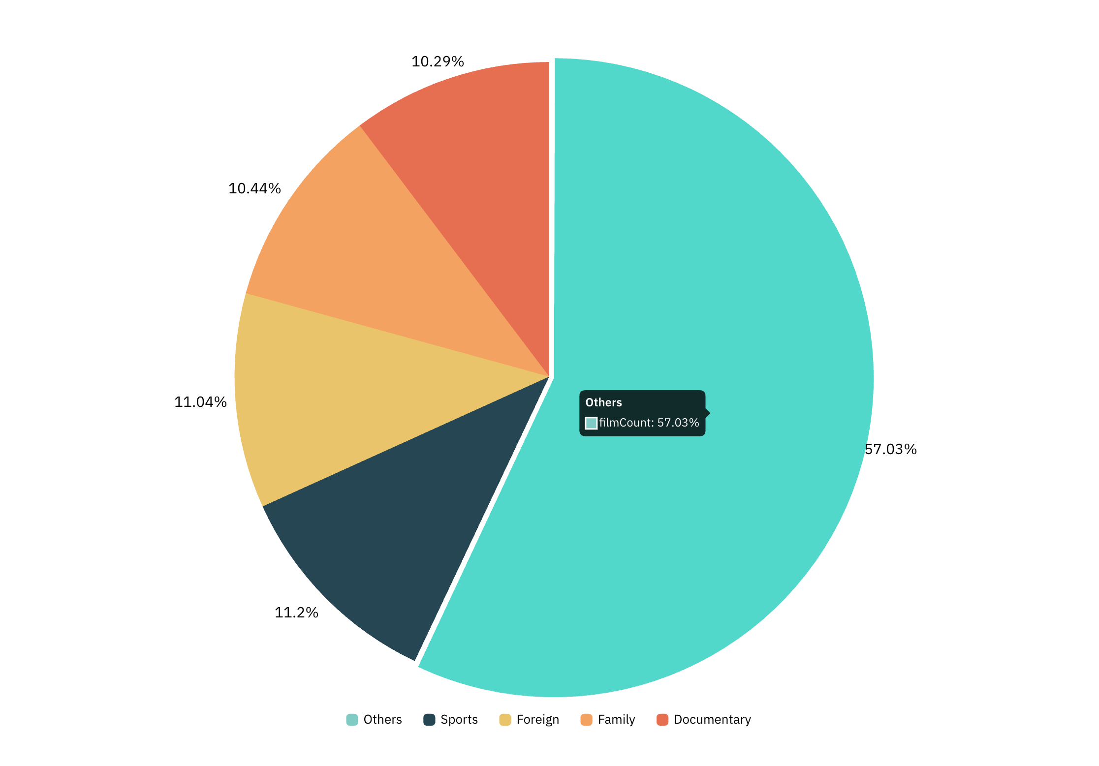
How to visualize your Supabase data?
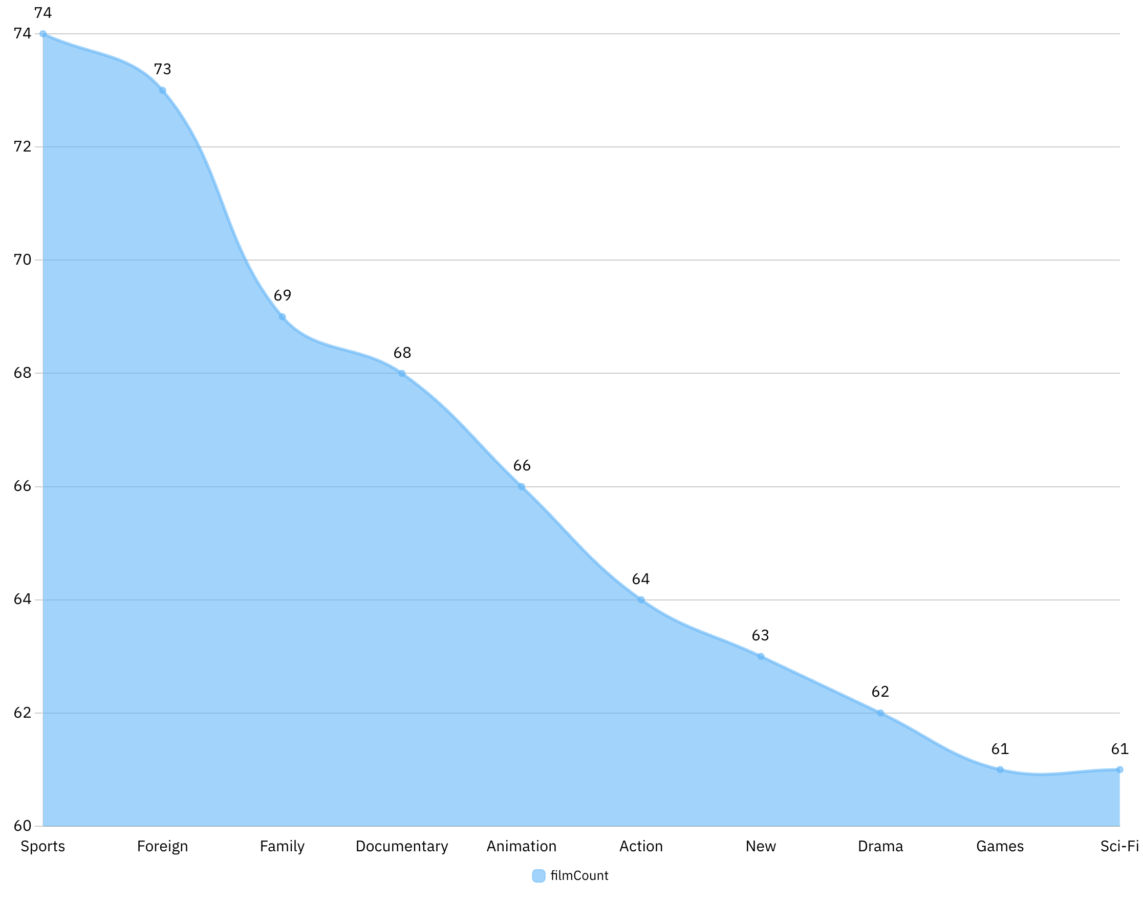
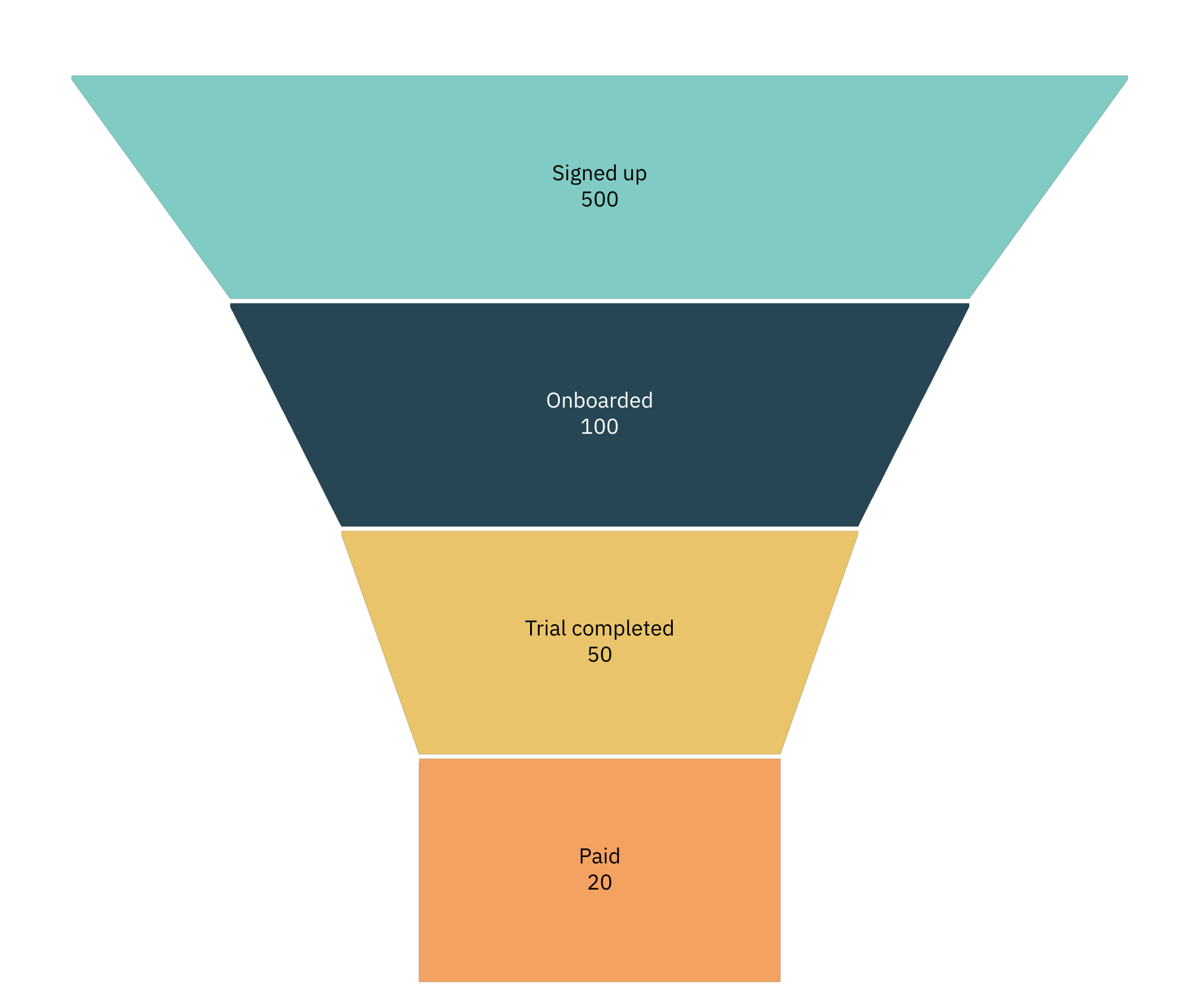
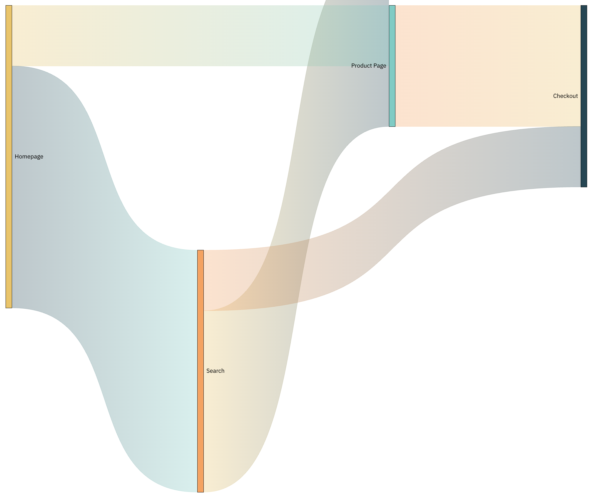
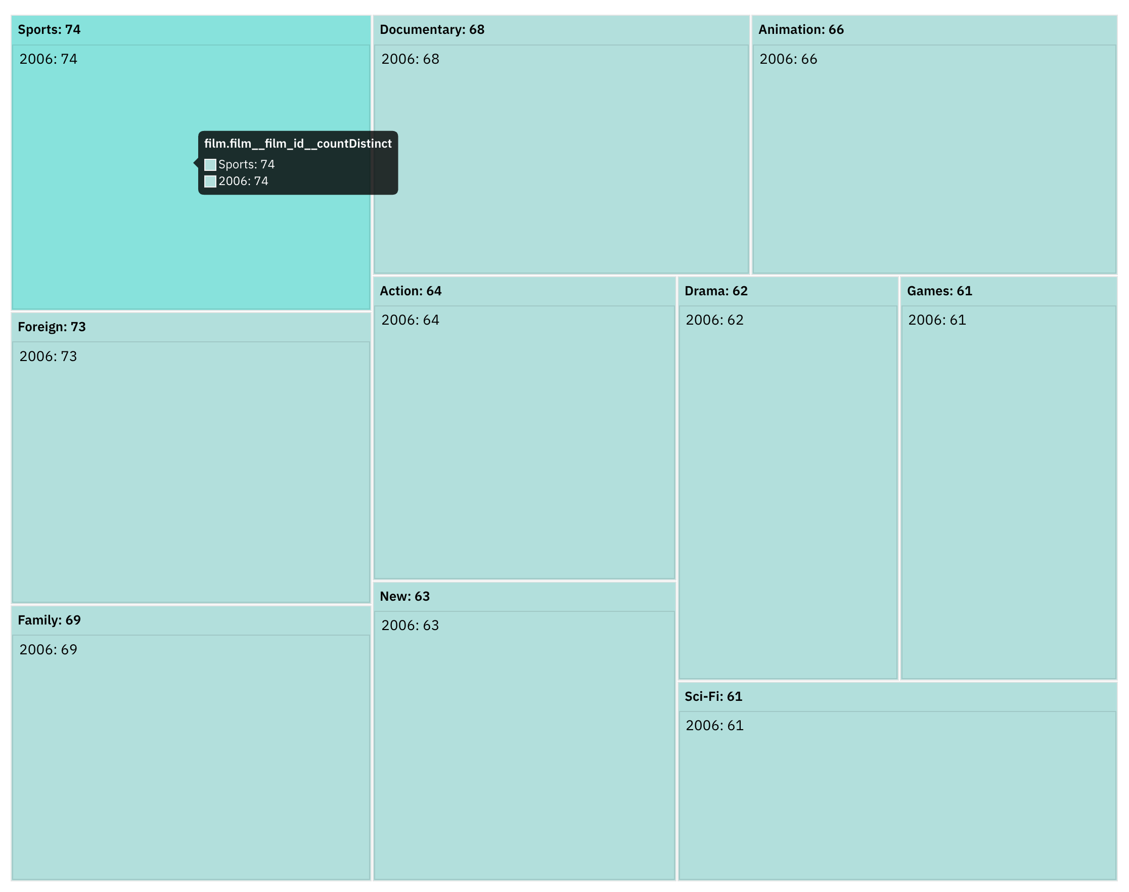
Once you have the SQL query, you can now choose a visualization for your data. Draxlr offers multiple chart types, including:
-
Bar Chart
-
Pie Chart
-
Area Chart
-
Funnel Chart
-
Sankey Chart
-
TreeMap Chart
-
and more
Each chart type comes with extensive customization options, allowing users to personalize their visualizations to match their data needs and presentation preferences. Users can modify colors, labels, axes, and other elements to enhance clarity.
Adding Visualizations to Dashboards
Once a query is built and visualized, Draxlr allows users to add these visualizations to dashboards. This feature helps consolidate multiple insights in one place, making it easier to monitor and analyze data trends.
Some key features of Draxlr Dashboards:
- Ability to add filters on dashboards to refine data views dynamically
- Drill-down on graphs to explore detailed insights
- Embed dashboards into web applications or external platforms
- Real-time dashboard refresh to display live data on screens or TV monitors
- Secured dashboard sharing with password protection
- Automated email summaries of dashboards, sent periodically to stakeholders
- Customizable layouts to arrange visualizations for better clarity
- User access controls to define permissions for viewing and editing dashboards
Setting Alerts
To stay informed about critical data changes on your visualizations, Draxlr allows users to set Slack or Email alerts.
You can also sync the visualization result into a Google Sheets, or access it via an API.
Frequently Asked Questions (FAQs)
-
Does Supabase have analytics?
Supabase does not provide built-in analytics, but you can use third-party tools like Draxlr to visualize and analyze your Supabase data effectively.
-
Which software is best for data visualization?
The best software depends on your needs. Draxlr is an excellent choice for Supabase users due to its seamless integration, SQL query builder, and advanced visualization capabilities.
-
What is the AI tool for data visualization?
Draxlr provides AI-powered query generation, enabling users to generate SQL queries effortlessly, making data visualization faster and more accessible without manual SQL coding.
Conclusion
Draxlr’s capabilities make it an excellent choice for Supabase users looking to enhance their data visualization and monitoring experience. Whether using query builder, raw SQL, or AI-generated queries, Draxlr provides a seamless way to turn Supabase data into actionable insights.