Bar Chart Maker
Create unlimited stunning Bar graphs for free in seconds and embed Bar graph into any website without writing code. Or download Bar chart as a high-quality image for offline use.
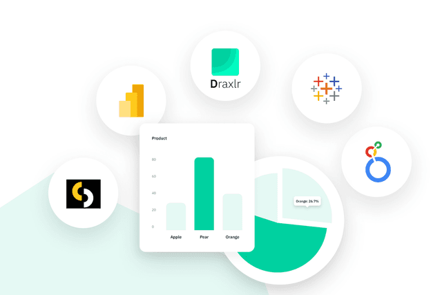
Take it further
Turn static charts into live dashboards powered by your own SQL database. Explore secure deployment, app embedding, and team features.
Build Dashboards for SQL Databases
Draxlr connects directly to your favorite SQL databases, so you can build dashboards, automate reports, and visualize live data without writing complex integrations.

PostgreSQL
Connect, query with AI SQL, and build live dashboards.

MySQL
Fast setup for product and analytics use cases.

Supabase
Ship charts inside your Supabase app with secure embedding.

MariaDB
Drop in replacement for MySQL with smooth onboarding.

Microsoft SQL Server
Enterprise friendly with granular permissions and alerts.

CockroachDB
Resilient charts and dashboards at global scale.

Redshift
Warehouse to dashboard in minutes with cached queries.

PlanetScale
Vitess powered workflows for app analytics.

Yugabyte
Postgres compatible, distributed by design.

Neon
Turns Neon’s serverless Postgres into a full-featured analytics

BigQuery
Google BigQuery dashboards with fast exploration and sharing.

Snowflake
Cloud data warehouse analytics with governed metrics.

ClickHouse
Real-time event and log analytics without complex setup.

Databricks
Lakehouse dashboards with governed metrics and fast insights.
Features
Make Awesome Bar Graphs with No Limits!
Tired of tools that cap your data? Our free bar graph generator, Draxlr, lets you input as many rows and columns as you need - no data is too big. Whether you have a mountain of data or just a bit, you can showcase it all. Dive into the world of unlimited data visualization and make your graphs truly stand out!
Compare Data Easily with Multiple Axis Accommodation
Our bar graph maker, Draxlr, lets you use multiple axes, so you can easily compare different data sets with different scales. Whether it’s sales figures and temperatures, or any other data, see it all clearly in one graph!
Easily Upload Your CSV Files for Awesome Bar Graphs
Upload your CSV files easily with our bar graph generator, Draxlr, designed for unlimited rows and columns. Simply click the upload button, and our tool seamlessly converts your data into comprehensive bar graphs, regardless of size or complexity. With our CSV upload feature, every detail of your dataset is accurately represented, providing you with an efficient way to visualize extensive information.
Save Your Stunning Bar Graphs as High-Resolution Images
Once your data is transformed into detailed bar graphs using our maker, Draxlr, you can effortlessly download them as high-resolution images. This feature ensures that your graphs are presentation-ready, perfect for reports, professional documents, or sharing with colleagues. Enjoy the convenience and quality of high-resolution image downloads for all your data visualization needs.
Customize Your Graph with X-axis, Y-axis Labels, and Titles
With our Draxlr bar graph maker, you can easily customize the X-axis, Y-axis, and graph title. Make your graphs clear and personalized to show exactly what you need!
Flexible Display Options: Show/Hide Legend, X-Axis Labels, and Logarithmic Graphs
Want a simple and clean graph? Our bar graph maker lets you easily show or hide the legend and X-axis labels, plus create logarithmic graphs. You decide how detailed or streamlined you want your graph to be, and handle complex data with ease!
Switch Up Your Graph: Vertical or Horizontal
Get the perfect look for your graph! With Draxlr, you can switch between vertical and horizontal orientations. Tailor your graph to best showcase your data and make a lasting impact.
Efficient Data Inline Editing for Real-Time Updates
Edit your data on the fly with our inline editing feature! Just click on the values you want to change and update them right there. No need to switch screens - keep everything simple and fast.
Enhanced Data Display: Show Values on Bars, Set Y-Axis Range and Sort X-Axis
Make your graph even better! Show values directly on each bar, sort the X-axis in ascending or descending order, and adjust the Y-axis range, including min and max values. Our tool makes it easy to organize, highlight, and tailor your data for maximum impact.
Advanced Trend Line and Statistical Analysis Options
Draxlr bar graph generator includes the ability to add trend lines using various regression formulas, including linear, exponential, logarithmic, power, and more. Additionally, you can apply general statistical formulas such as average, minimum, and maximum to your data, enabling a thorough and insightful analysis.
X-Axis Time Formatting with Custom Intervals
Easily format the X-axis of your graphs with time intervals like day, week, month, and more. Our tool makes it simple to display your time-based data exactly the way you need, helping you see trends and patterns over different periods.
Perfect Your Graphs: Add Prefixes, Precision, and Postfixes
Easily customize how your data looks with our bar graph maker! You can add prefixes like currency symbols or postfixes like units of measurement to your values and set the precision to show the exact amount of detail needed. Whether you're displaying dollars, percentages, or units, make your graphs look just the way you want them and ensure your data is clear and easy to understand.
Embed bar charts into any site with one click!
Draxlr allows you to embed bar chart instantly by copying a complete iframe code. The chart maintains its labels, colors, and layout exactly as you created. Simply paste the code into your site or blog to display live visuals instantly.
FAQs (Frequently Asked Questions):
How do I upload data to create a bar chart?
You can upload your data in CSV format using the upload feature on our webpage. Once uploaded, the data will be displayed in a tabular format for you to review and edit.
Can I customize the colors of my bar chart?
Yes, you can customize the colors of your bar chart. Our tool offers various color options to help you create a visually appealing chart.
Can I download the bar chart once it's created?
Yes, you can download your bar chart as a PNG file with a transparent background. This makes it easy to use your chart in presentations, reports, or websites.
Is it possible to edit the data after uploading the CSV?
Yes, after uploading the CSV, the data will be displayed in a tabular format where you can make any necessary edits before generating your bar chart.
Our Top Blogs


Ready to create SQL Dashboards
& Alerts?
Launch in minutes with your SQL database and ship analytics your team can trust.
This website uses cookies to ensure you get the best experience.